Service designers know that innovation is a mess
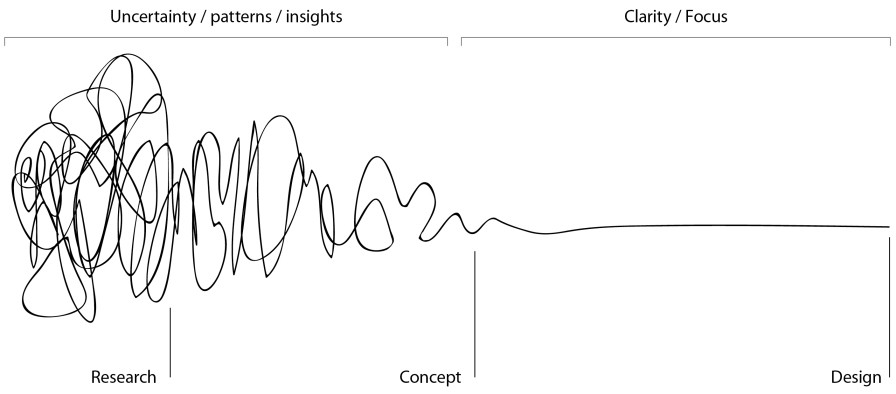
The Design Squiggle Model shows how messy and non-linear the design process is.
I have to say that I really like this model. Often, to explain how things work, we see clean models and beautiful diagrams. The style of this model is already saying a lot: it’s really messy 🙀!
A lot of our work when we search for answers feels like a mess of too much information and a lot of back and forth ↩️. It’s only with time that things start to get clearer.
This model created by author and designer Damien Newman has three parts.
The first one is the research phase 🔎. This phase is hell. It’s messy, it’s a lot of work and back and forth. Uncertainty is high.
The second phase is the concept phase 💡. Here, the mess is reduced. But you have already narrowed down where you want to go. You might not have the perfect solution at hand but it’s clearer. Therefore, there is less doubt and uncertainty here.
The final and third phase is the design phase 🛠. That’s more or less a straight line. You know what you want to achieve and you just have to put the work in. But doubts and uncertainty are now mostly out of the way.
It’s interesting to see that, basically, half of the model is just messy. I think this is how we often feel as service designers. A big chunk of our work is in the messy part.
The final point which I find extremely interesting in this model is that it’s a non-linear journey. This model perfectly shows that an innovation project is not a straight road 🤯. You might have to go back and start again, as the many curves and loops of the squiggles show.
This model is a great tool that service designers use to show how messy the different phases of an innovation project can be. Just as before, knowing which phase you are in gives a sense to the emotions you feel 🧠. If you are in the research phase, it’s totally normal to sometimes feel overwhelmed.