Show me how steep it will be
A Service Design principle for better accessibility.
We are walking in Lausanne, Switzerland, with my wife and child. The view of the lake is pretty lovely, but as often my eyes got interested in tiny detail.
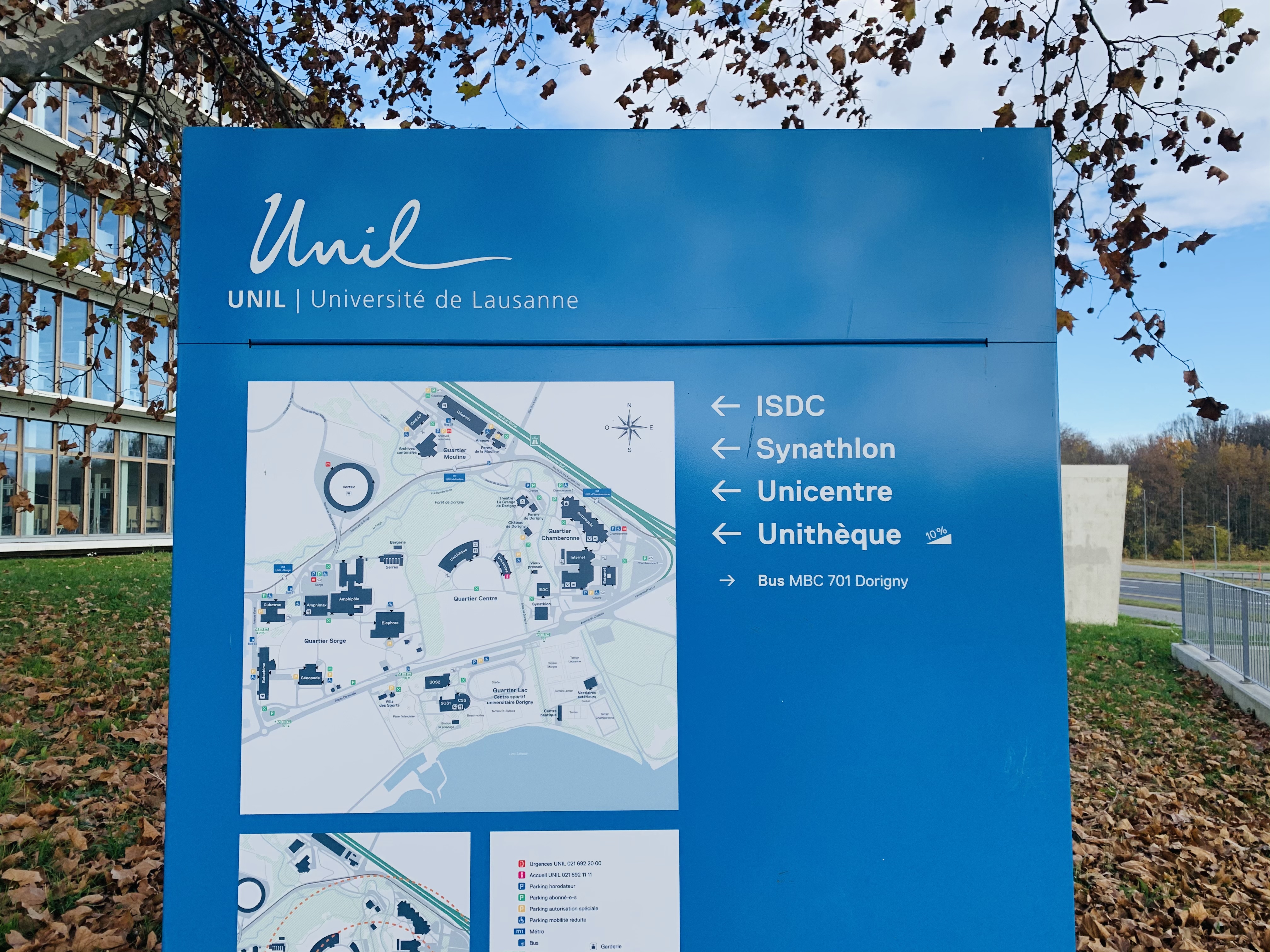
On a signage panel from the university, I notice a tiny icon that I have never seen before.
The signage panel near the university library in Lausanne, Switzerland.
The sign shows how steep that particular path is. It warns people we reduced mobility that they might want to take another road.
That helps people save time. They won't take a path that, in the end, is too hard for them and forces them to come back.
Little side notes
This is the second draft of this Service Design Principle.
I was able to reduce the lengths of this principle by 37.5% compared to the first version.
Once adapted, even more, this principle will be part of the book "Service Design Principles 201-300"
As always comments and feedback to improve this principle are welcome
If you have a personal story that goes in that direction it would also help if you share it


We -> with
But it would be brilliant if they also show the alternative route is. Maybe that’s another principle
The third draft of this Service Design Principle
Daniele’s notes