Show me where my money goes

A Service Design Principle to create financial trust
Why the fuck do I have to pay so much taxes? That's a genuine question you ask yourself when you fill out your taxes every year.
The smart people of the Canton de Vaud Tax office (the region where I live), try to answer that question even before you start complaining in your head.
When you get the document with the access codes to fill your taxes online, you also get a document titled: "The usefulness of filling your taxes".
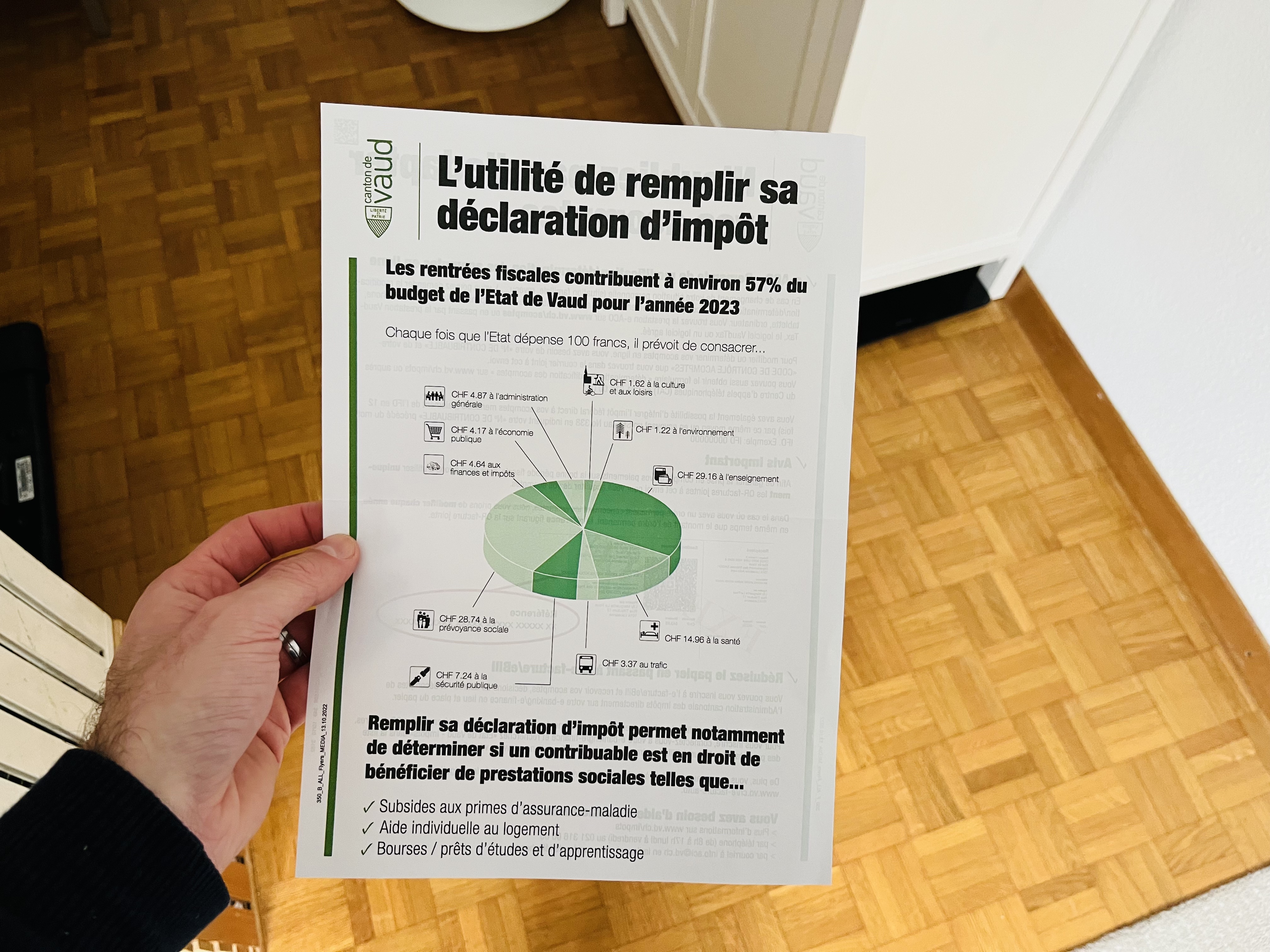
In that document, you can see a pie chart showing how the money you give to taxes is used. For example, it shows that each time the state spends 100 bucks, about 29,15 bucks go towards education.
At the end of the document, some additional benefits are highlighted. If you fill your taxes, the state knows if you are eligible for state help programs (for example, for health insurance, rent, and so on).
This way of showing where the money goes is something that is not used only by tax offices. I've seen in the past software companies explain their prices like that, or NGO show how much of your donation gets used for administrative work, marketing and the actual help in the field.
Action question
How can you be transparent about how the money that people invest in your service is used?
Daniele's note
This is a first draft of a principle that might end up in a book of the "Service Design Principles" series.