3. Show me where I am
3. Show me where I am
Ten simple UX rule of thumbs
The 10 simple rule of thumbs of UX
The 10 simple rule of thumbs of UX

When people use an app, they always should know where they are within that app.
Use page titles
Once people clicked on a button and arrive on another screen they should know directly that they arrived on the right screen. In order to do that, always use a title for every page or screen of your app.

In fact, there are screens which might look very similar. For example, the login and sign up screen might look nearly the same 🤦 That's why a big and visible title can help the user understand if he is about to create an account or logging in the app.
Show active states
When you use navigation bars that are visible on all pages and that make it possible to change screen it's a good idea to always show which is the active page.
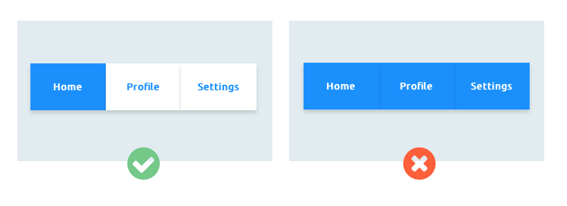
So for example, if I'm on the home page, I should know that by looking in my navigation bar. You could change the color of that "Home" button so that it looks different from all the other navigation buttons.
By doing so, as a user, I always now which is the page that I'm on. And if the design is pretty clear, you might not even need to have a title as the navigation bar does also that job by showing which page is active. Neat, right? 🤓