9. Don't reinvent the wheel

Reuse similar design elements than the leading websites and apps that people already use.
If most apps use a trash bin icon to express the idea of "deletion" then it might be a pretty bad idea to use that same symbol as the icon for your "archive" page.
There are a lot of visual conventions in web or app design that you can use. It makes sense, for example, to use a navigation bar to pass from one page to another, a hamburger menu icon to show a list of all pages, or an arrow to say that we can go back. These are conventions that are used in very popular apps like the ones built by Facebook, Apple, Google, or Microsoft. Basically it's as if these guys invented a language and you can steal it so that people who use these apps, then already know how to use your app.
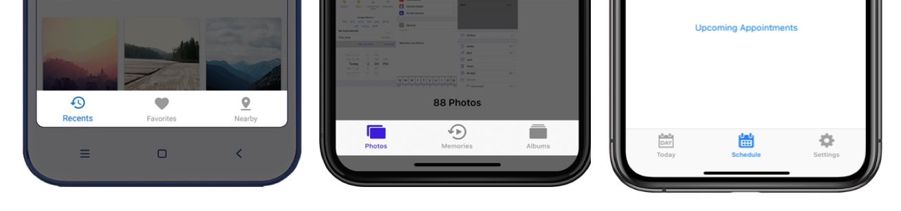
The image above shows you a navigation bar in different apps but that uses the same visual convention.
These conventions are called "patterns" by designers. You can see examples of such patterns on the website UI Patterns.